Tutorials
Under construction(1) Getting started
(2) Namelists
(3) Verification
(4) Input data
(5) New schemes
Verification examples
We will use the results from the tutorial run to illustrate
verification plots. Make sure you are in the directory with the verification files:
cd results/tutorial/verif/
Below are examples of some of the verification metrics available. For a full listing, run
verif without any arguments.
Deterministic metrics
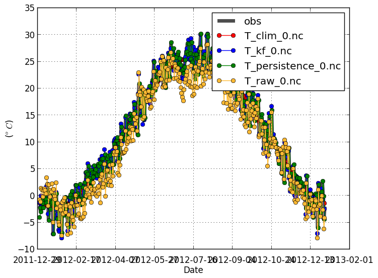
Obs/Forecast (-m obsfcst) |
|
|---|---|
|
This shows the climatology of the observations and forecasts, to see if the forecast is able to capture the overall signal.
By default, the plot is shown with the forecast offset on the x-axis. Data is then averaged over all
dates and locations. Use |
|
verif T*.nc -m obsfcst
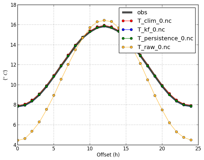 |
verif T*.nc -m obsfcst -x date
 |
Mean absolute error (-m mae) |
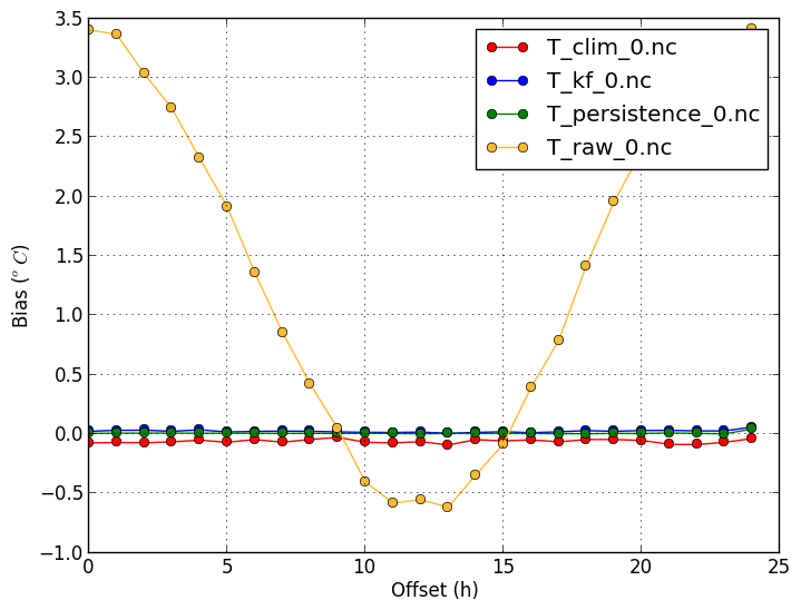
Bias (-m bias) |
verif T*.nc -m mae
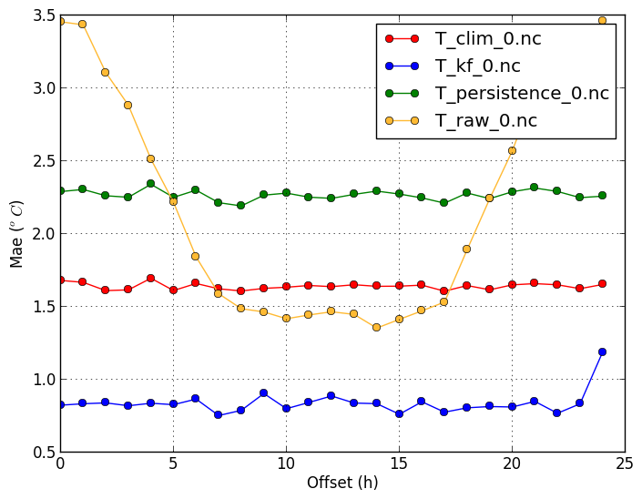 |
verif T*.nc -m bias
 |
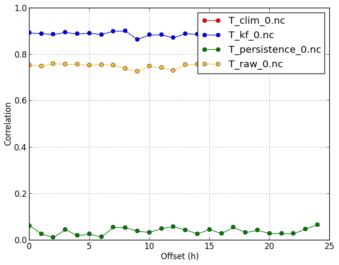
Correlation (-m corr) |
|
|
Since temperature has strong and predictable annual variation, the correlation values are often very close to 1. Correlation is therefore almost exclusively determined by the system's ability to capture the climate. Anomaly correlation therefore gives a better picture of the performance of the forcast system in this case. |
|
verif T*.nc -m corr
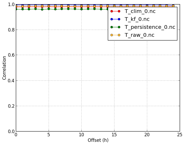 |
verif T*.nc -m corr -c T_clim_0.nc
 |
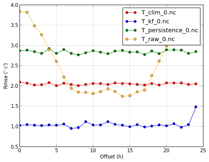
Root mean squared error (-m rmse) |
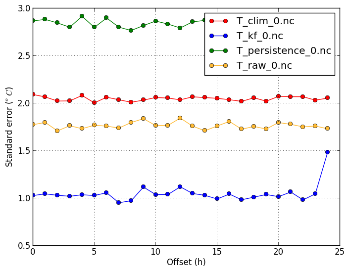
Standard error (-m stderror) |
| RMSE shows similar results as MAE, except that it penalizes big errors more. |
Standard error shows the standard deviation of the forecast errors. This equals the RMSE of the forecast after the mean bias has been removed. It shows what RMSE value can be attained with proper bias-correction. The standard error of the raw forecast is lower than its RMSE, because of its slight bias. This confirms that the Kalman Filter does more than just remove the mean bias, as its standard error is still lower than the raw's. |
verif T*.nc -m rmse
 |
verif T*.nc -m stderror
 |
Within (-m within) |
|
| This plot shows what fraction of forecasts are close to the observations. | |
verif T*.nc -m within -r 1
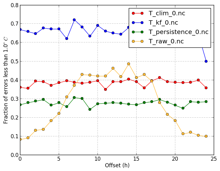 |
verif T*.nc -m within -r 2
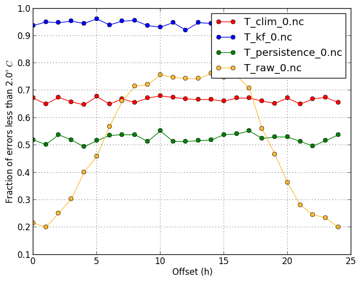 |
Deterministic ROC (-m droc) |
|
|
Forecast users must often a balance reducing missed events and reducing false alarms. The ROC diagram shows the tradeoff between hitting events and getting false alarms, but using different thresholds. For example, a user who is susceptible to observed temperatures above 11 degrees can use different forecast thresholds (such as 10, 11, or 12 degrees) to define if they need to take action or not.
However, since temperature vary greatly throughout the year, the standard ROC diagram to reveal high hit rates and low false-alarm rates, because for most of the year the
temperatures are far from the threshold. By suplying a climatology file through the |
|
verif T*.nc -m droc -r 11
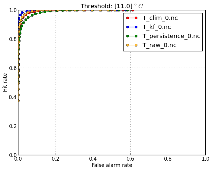 |
verif T*.nc -m droc -r 0 -c T_clim_0.nc
 |
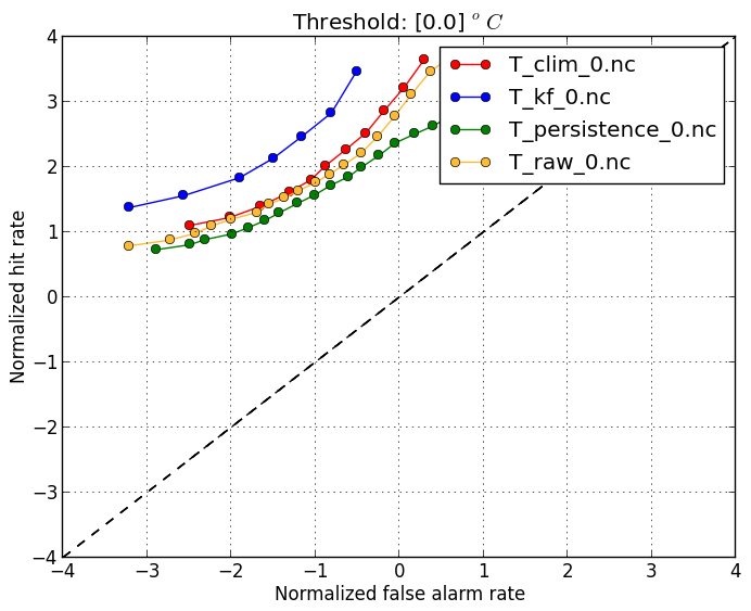
Normalized deterministic ROC (-m drocnorm) |
|
|
Forecast users must often a balance reducing missed events and reducing false alarms. The ROC diagram shows the tradeoff between hitting events and getting false alarms, but using different thresholds. For example, a user who is susceptible to observed temperatures above 11 degrees can use different forecast thresholds (such as 10, 11, or 12 degrees) to define if they need to take action or not.
However, since temperature vary greatly throughout the year, the standard ROC diagram to reveal high hit rates and low false-alarm rates, because for most of the year the
temperatures are far from the threshold. By suplying a climatology file through the |
|
verif T*.nc -m drocnorm -r 11
 |
|
Threshold-based metrics
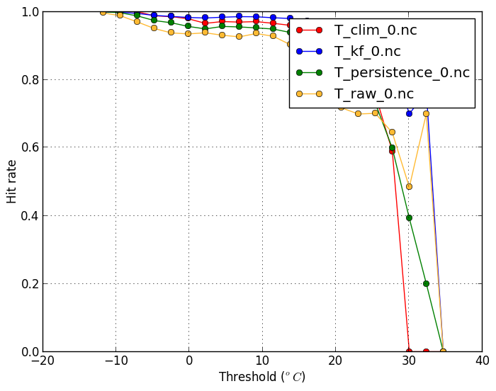
Hit rate (-m hitrate) |
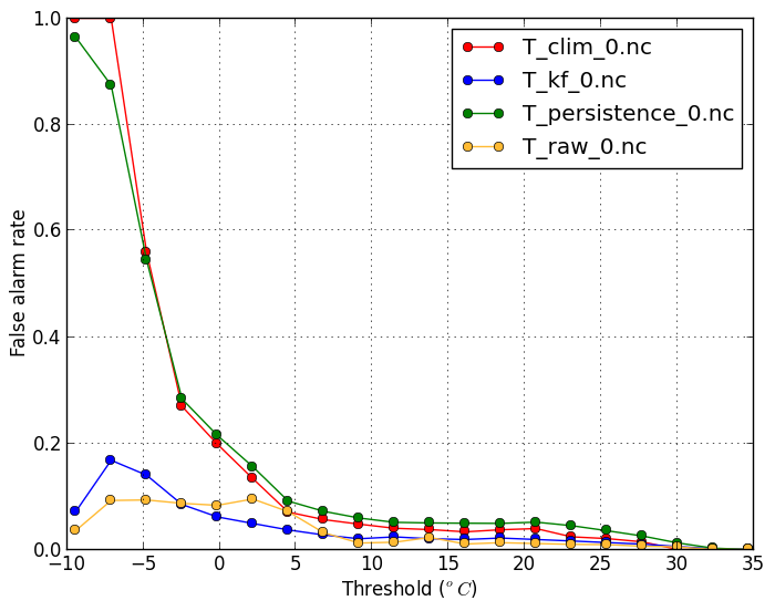
False alarm rate(-m falsealarm) |
|---|---|
| This plot shows what fraction of events exceeding a threshold are forecasted. A high hit rate is desirable. | This plot shows what fraction of forecasts of temperatures exceeding a threshold are in fact false alarms. A low false alarm rate is desirable. |
verif T*.nc -m hitrate -x threshold
 |
verif T*.nc -m falsealarm -x threshold
 |
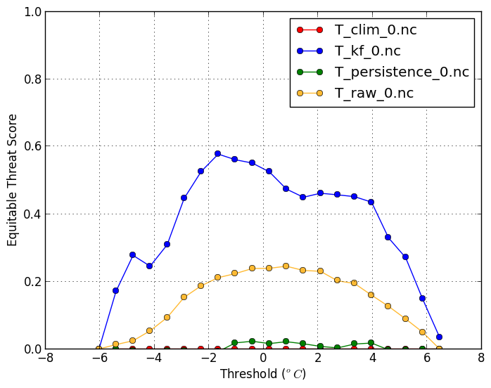
Equitable threat score (-m ets) |
|
| The ETS balances the hit rate and false alarm rate. A high ETS is desirable and has a maximum value of 1. The ETS plot using anomalies is also useful. | |
verif T*.nc -m ets -x threshold
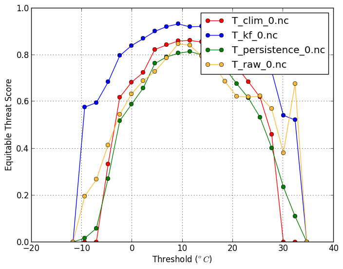 |
verif T*.nc -m ets -x threshold -c T_clim_0.nc
 |
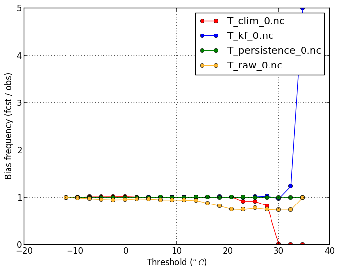
Bias-frequency (-m biasfreq) |
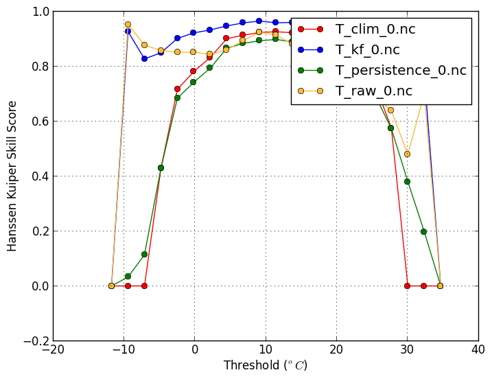
Hanssen-Kuiper Skill Score(-m hanssenkuiper) |
| This plot shows if certain events are forecasted more frequently than is observed. | |
verif T*.nc -m biasfreq -x threshold
 |
verif T*.nc -m hanssenkuiper -x threshold
 |
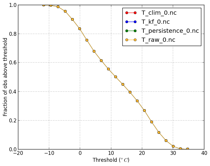
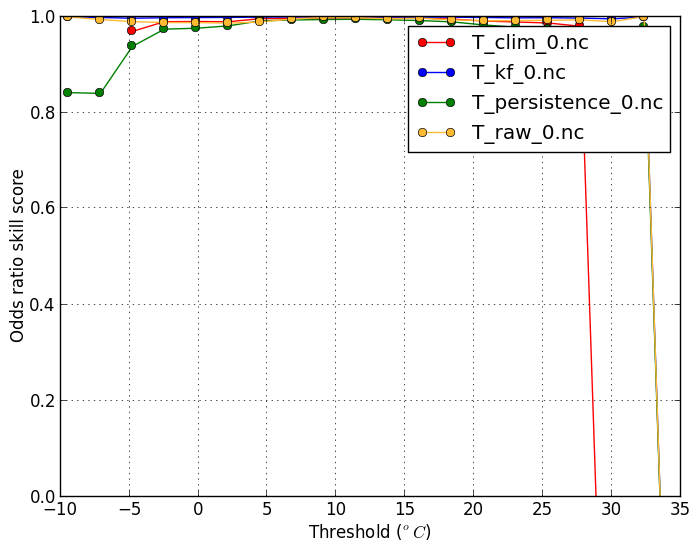
Base-rate (-m biasfreq) |
Odds-ratio Skill Score(-m oddsratioss) |
| This shows the climatological frequency of the observation being above the threshold (11 degrees C in this case). | |
verif T*.nc -m baserate -r 11
 |
verif T*.nc -m oddsratioss -r 11
 |
Probabilistic metrics
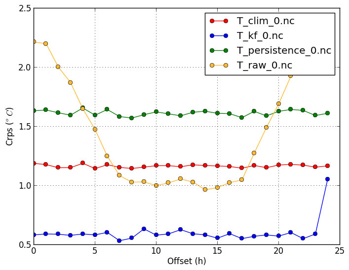
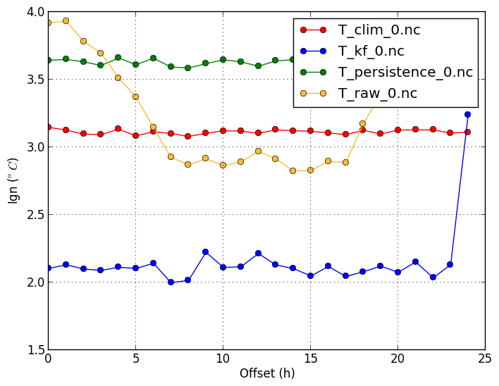
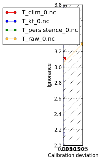
Continuous Ranked Probability Score (-m crps) | Ignorance score (-m ign) |
|---|---|
|
The CRPS can be compared to the mean absolute error. It will in general be lower than the MAE. One exception is a deterministic forecast using a step-function for the cumulative probability, in which case the CRPS and MAE will be the same. Low CRPS scores are desired. |
A disadvantage of the CRPS is that it does not penalize forecasts that gave a 0% chance for an event that has indeed occurred. Whether the forecast was 0%, 0.001%, or 0.1% makes little difference to the score. The ignorance score is largely affected by the choice of those low probabilities. Low ignorance scores are desired. |
verif T*.nc -m crps
 |
verif T*.nc -m ign
 |
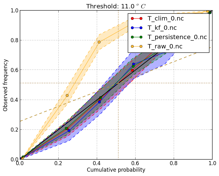
Reliability diagram (-m reliability) | |
|
This is useful to check that probabilities at a threshold are accurate. It shows the frequency of
occurrence when giving different event probabilities. Scores should ideally fall on the diagonal line.
Use
This plot requires the verification file to store the cumulative probability at the threshold. To get
the reliability at threshold 11 degrees, add the The shading shows a 95% confidence interval. |
|
verif T*.nc -m reliability -r 0
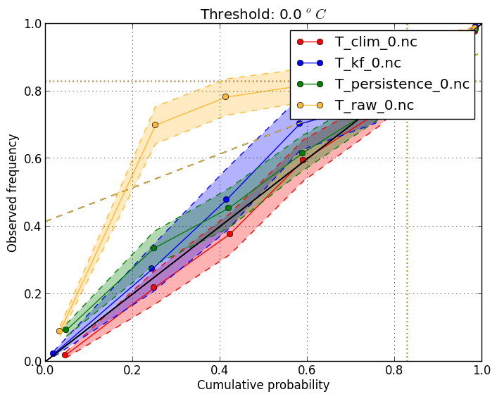 |
verif T*.nc -m reliability -r 11
 |
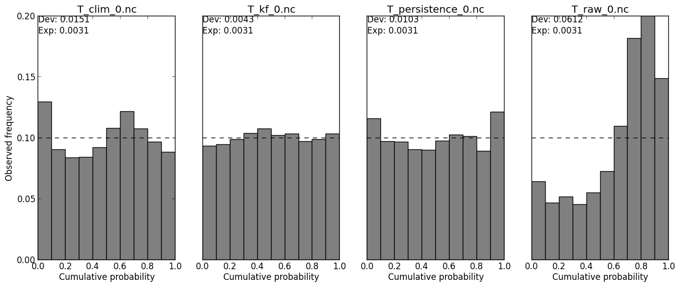
PIT histogram (-m pit) | |
|
This shows what percentiles of the forecast distribution the observations tends to fall in. If the forecast is calibrated, the histogram should be even. Even a perfectly calibrated forecast is expected to have some unevenness, due to sampling error. The measured and expected calibration deviation is shown in the upper left corner. When the forecast distribution is under-dispersed, the PIT histogram will U-shaped, because too many observations will fall in the low and high percentiles. |
|
verif T*.nc -m pit
 |
|
Ignorance score decomposition (-m igndecomp) | Spread-skill (-m spreadskill) |
|
The ignorance score can be decomposed into two component. When a forecast has an uneven PIT-histogram, there is an opportunity to calibrate the forecast, such that the histogram is even. This calibration will decrease the ignorance score of the forecast. The ignorance of a forecast is therefore the sum of the potential ignorance and the ignorance due to deviation in the PIT-histogram. This plot shows what can be gained by calibrating the forecast. [more here]. |
This shows if the spread of the ensemble is a useful indication of the ensemble mean's skill. Ideally the accuracy of the ensemble mean should decrease as the spread of the ensemble increases. |
 |
 |